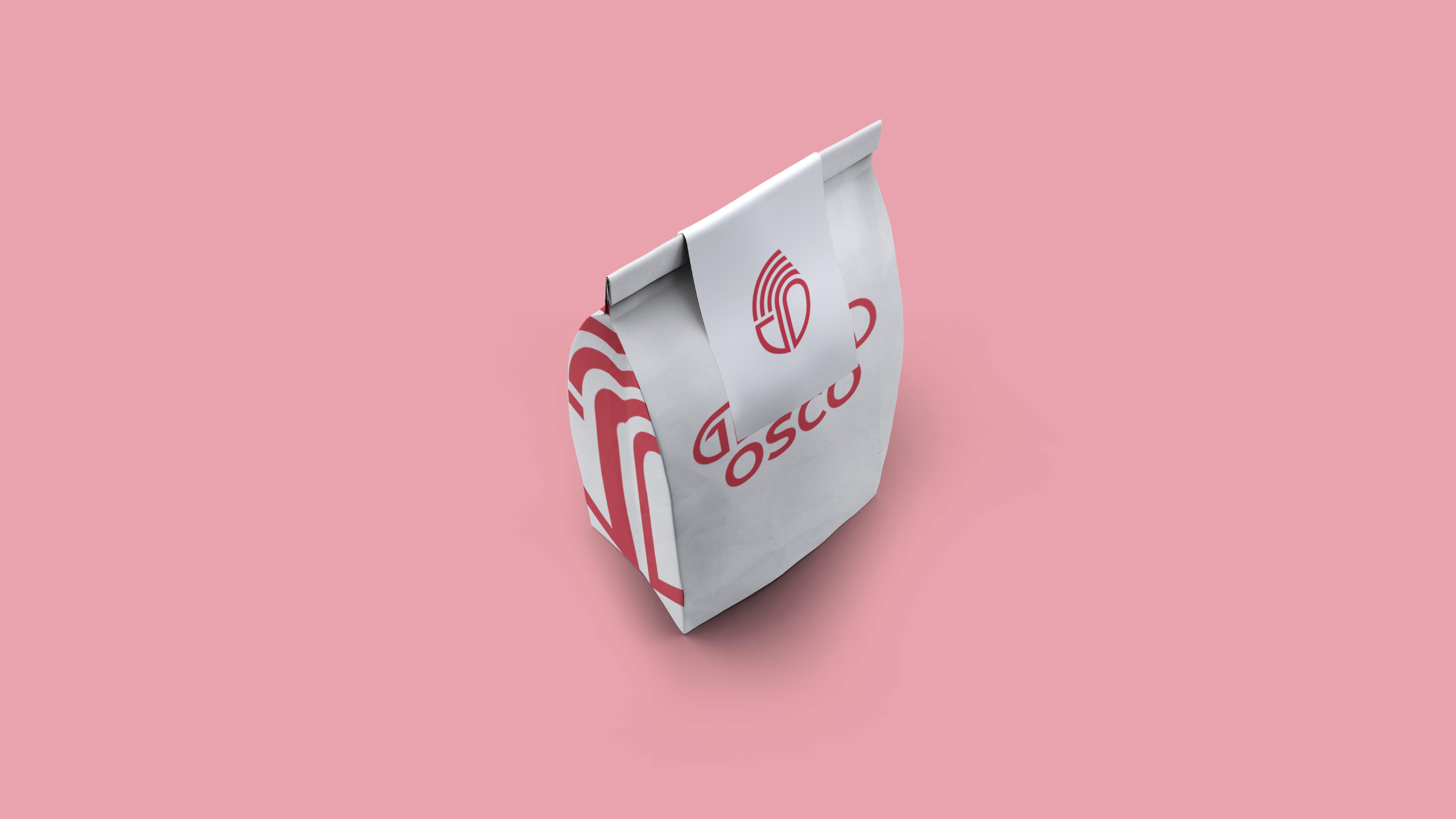
Jewel Osco
Redesigned the Jewel‑Osco logo to align the dual wordmarks, harmonize letterforms, and perform on strict grid‑based interfaces. The logo preserves brand familiarity while improving clarity at small sizes across app, web, and packaging.
Client
Type
Year

Current Logo
Dual wordmarks misaligned (top left, bottom right) → visual imbalance.
Custom J diverges in weight/style from the rest of the type.
Lockup fights grid layouts; clarity drops at small sizes.